Frutero
Custom Word Mark • Brand Palette • Photo Direction • Packaging Design
Before Rebranding


Strategy
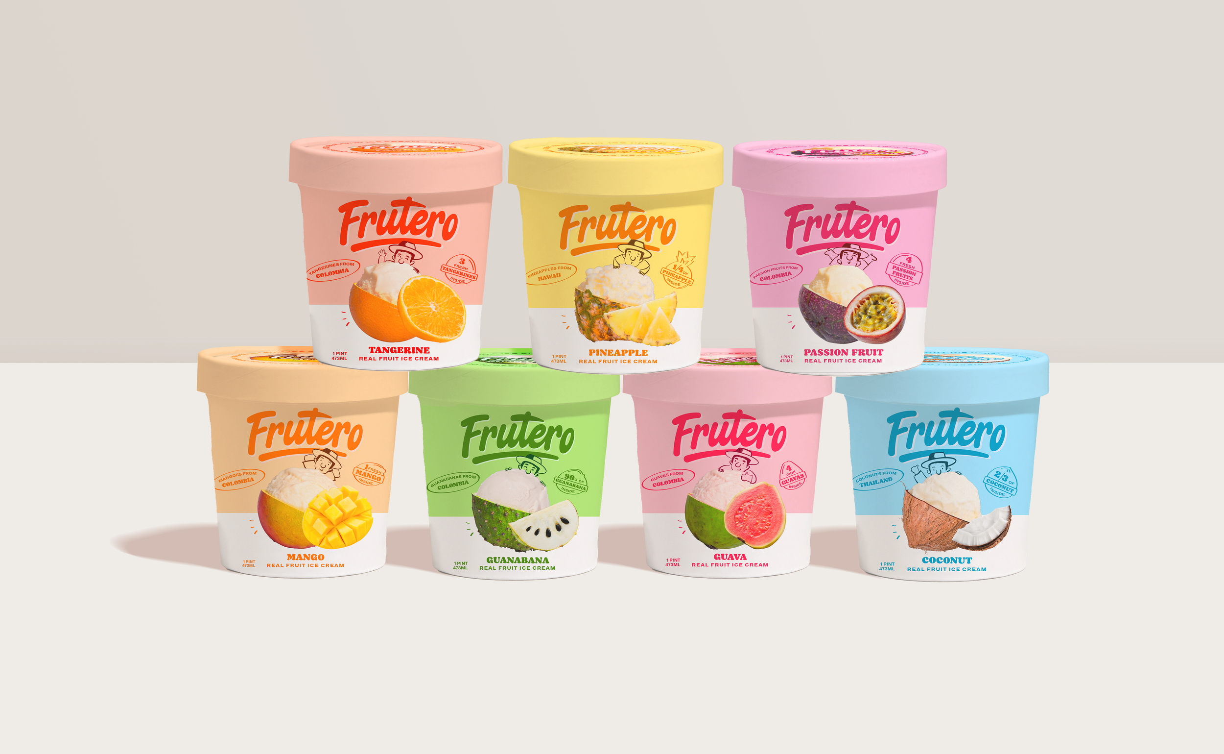
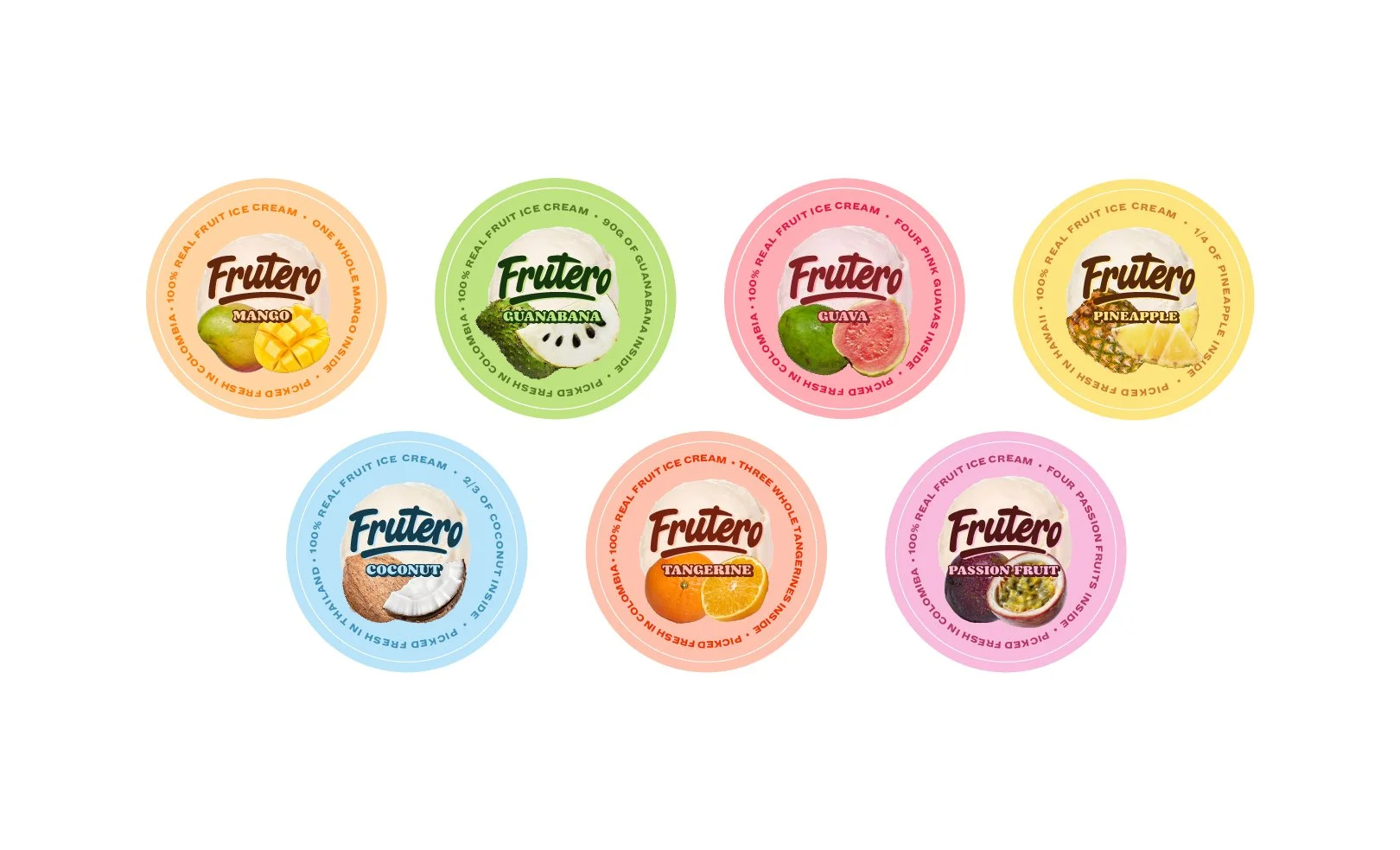
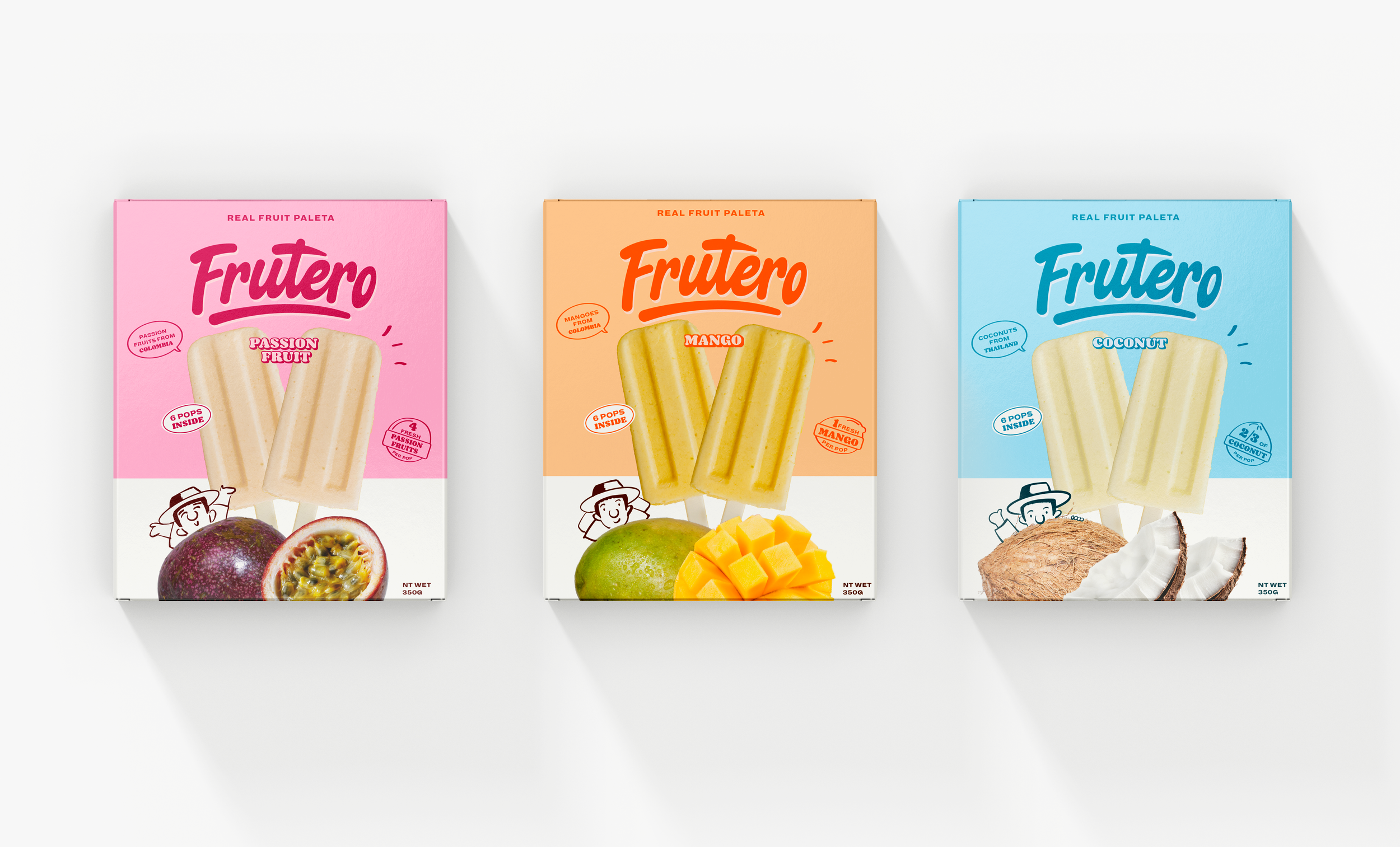
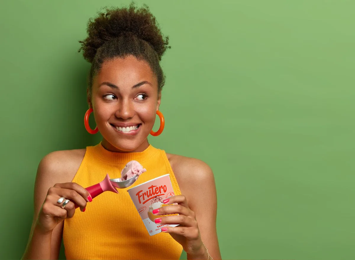
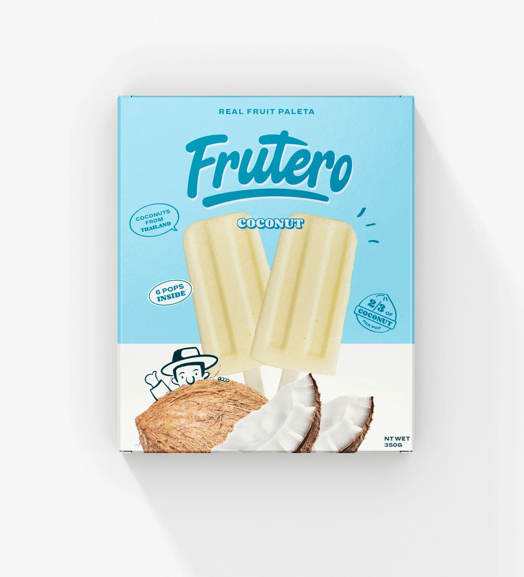
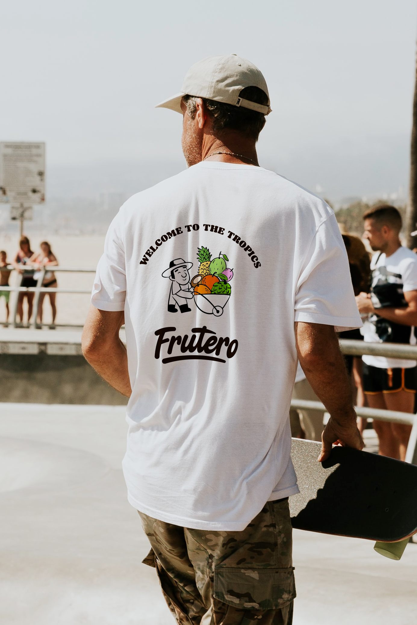
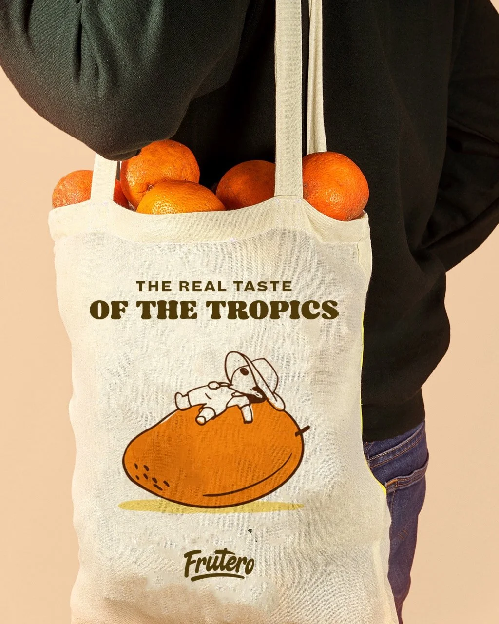
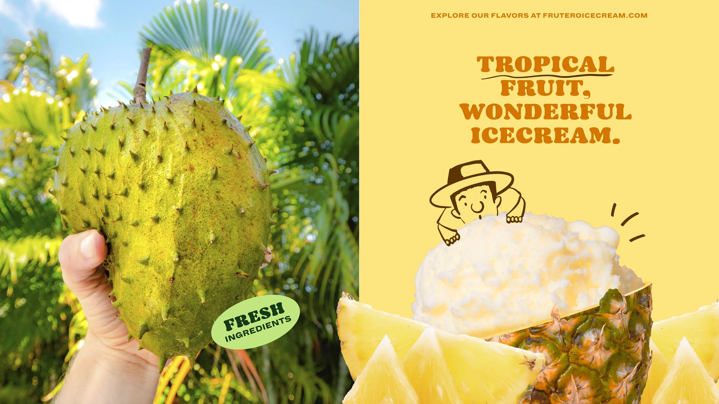
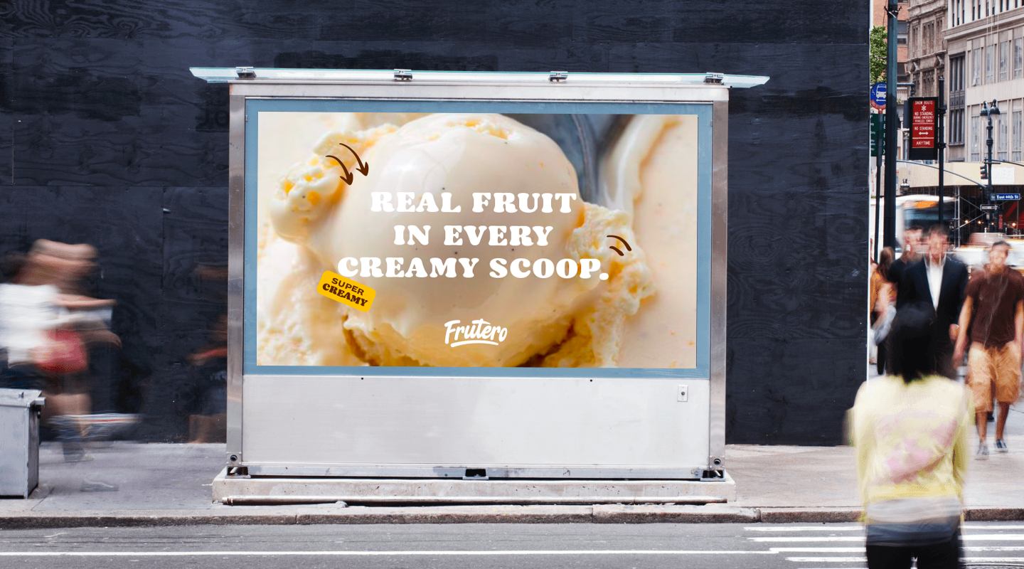
Frutero had a heavy emphasis that they were a creamy, lavish, and sophisticated ice cream, not a sorbet. This creaminess had to come through. Our custom lettering conveys this sense of rich ice cream by channeling rounded caps, thick curves, and bouncing baseline into an approachable word mark. We wanted to retain Frutero’s halved packaging, as it was recognized widely among consumers. We elevated this style with new creamier colors, and a photo collage of turning the fruit into an ice cream bowl. With custom illustrations and playful language, this rebrand highlights a playful sophistication that will have everyone screaming for…Frutero.